
Monero Stock to Flow (S2F) Calculated
In this article we’re going to look at Monero’s stock to flow, which is a way of evaluating its future scarcity.
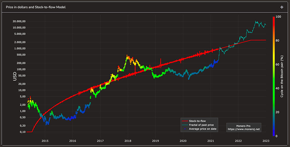
But first, if you’ve arrived at this post looking for the Monero equivalent of Bitcoin’s stock to flow model, you can find something similar at Twitter user CryptoMorpheus’ website here.
His model emulates the stock to flow pricing model that was popularized in Bitcoin via Plan B, and later turned into a website.
It’s worth noting that whilst the Bitcoin model has been relatively accurate in predicting its future price, it’s unclear if the model by CryptoMorpheus will accurately predict the future price for Monero.
The rest of the post will focus on the concept of ‘stock to flow’, rather than ‘stock to flow price models’, so it’s important to separate out those concepts.
Stock to flow is a way to look at how scarce a resource is.
Stock to flow price models are a way to to combine stock to flow with historic price data, and model future price predictions.
*So this post is going to look at stock to flow, but why is that important?* Well, if we can understand how scarce an asset Monero is, we can compare it to other assets and start to make future price/value predictions.If it turns out the asset isn’t very scarce, relative to existing supply, then we know not to place too high a value on it.Stock to flow is particularly relevant to cryptocurrencies, which often often have a fixed emission curve. Versus fiat currencies, where central banks continue to inflate the supply at will.
Calculating stock to flow is a simple equation, it’s:
Stock (total in circulation) / Flow (total added per year)
So in Monero context, stock would be how much Monero is already mined and in circulation, and flow would be how much Monero is being created when each block is mined, multiplied out to represent 365 days worth.
The result of the equation gives you a number. The higher the number, the more scarce the resource is going forward.
At the time of writing (Jan 15, 2021), the stock to flow of Monero is:
Stock (17,813,880) / Flow (317,988) = 56
How to find the stock?
You can use bitinfocharts.com/monero/ to get the latest figure for the total Monero in circulation.
How to find the flow?
Again, you can use bitinfocharts.com/monero/ to get the latest figure for the block reward.
For example, in the above calculation, the block reward (every 2 minutes) is 1.21 XMR. So then you need to do:
1.21 x 30 x 24 hours x 365 days = 317,988 XMR
317,988 is the Flow – which is the emission rate per year.
It’s worth noting that with Bitcoin, the emission rate only changes once every 4 years. However with Monero, we’ll be decreasing from 1.21 to 0.6, between now and May 2022. At which point it will stay at 0.6 XMR per 2 minute block perpetually (“forever”).
The only thing that would change the emission rate is if the developers agreed to change it in the code. Currently that isn’t a topic under discussion.
How to combine the stock and flow?
Once you’ve got your figure for the stock, and the flow, just do:
Stock / Flow (stock divided by flow)
For a bit of historical context, the table below shows the estimated stock to flow of precious metals.
| Stock (tonnes) | Flow (tonnes) | Stock to Flow | Growth | |
| Gold | 185,000 | 3,000 | 62 | 1.6% |
| Silver | 550,000 | 25,000 | 22 | 4.5% |
| Palladium | 244 | 215 | 1.1 | 88.1% |
| Platinum | 86 | 229 | 0.4 | 266.7% |
Note that Gold, which is regarded as a scarce asset, has an approximate stock to flow of 62. That gives a mental benchmark for what’s rare and what isn’t. With lower numbers equaling less rare.
Comparing Monero to Bitcoin and Gold
The chart below illustrates how Monero’s stock to flow compares to Bitcoin and Gold.
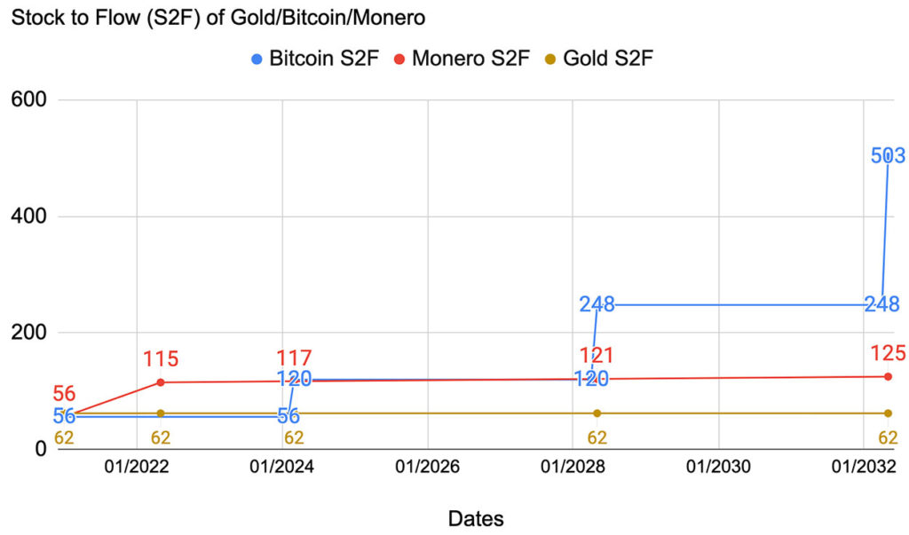
Essentially, once Monero’s tail emission kicks in around May 2022, Monero’s stock to flow stays roughly flat at around 115 - notably more scarce than Gold, which is around 62.
Then from May 2022 to March 2024, Monero supply is more scarce than Bitcoin. Around March 2024, Bitcoin’s supply halves, and then until 2028 the scarcity of new coins for Bitcoin and Monero is roughly comparable.
From 2028 and beyond, Bitcoin’s scarcity continues to increase dramatically. The table below shows how Bitcoin’s stock to flow increases with each halving:
| Date | Stock | Flow | Stock to Flow | Block Reward |
| 2020 Halving | 18,375,000 | 328,500 | 56 | 6.25 |
| Jan 15 2021 | 18,601,200 | 328,500 | 56 | 6.25 |
| 2024 Halving | 19,687,500 | 164,250 | 120 | 3.125 |
| 2028 Halving | 20,343,750 | 82,125 | 248 | 1.5625 |
| 2032 Halving | 20,671,875 | 41,062 | 503 | 0.78125 |
| 2036 Halving | 20,835,937 | 20,531 | 1015 | 0.390625 |
| 2040 Halving | 20,917,968 | 10,265 | 2038 | 0.1953125 |
| 2044 Halving | 20,958,984 | 5,132 | 4083 | 0.09765625 |
| 2120 Halving | 20,835,937 | 0.0021024 | 9,988,584,457 | 0.000000040 |
Monero’s Scarcity over the next 100 years
Due to Monero’s tail emission being fixed, the stock to flow will gradually increase over time, as the existing stock grows relative to the fixed annual flow.
Below you can see how, by 2122, Monero’s stock to flow reaches 215, approximately 4x what it is at the time of writing.
| Date | Stock | Flow | Stock to Flow | Growth |
| Jan 15 2021 | 17,813,880 | 317,988 | 56 | 1.78% |
| May 2022* | 18,132,306 | 157,680 | 115 | 0.87% |
| 2122 | 33,900,306 | 157,680 | 215 | 0.46% |
What about Ethereum?
Ethereum has long had the second highest aggregate value, in USD, after Bitcoin. But is it “hard money”?
Calculating the stock to flow of a cryptocurrency gives us a point in time value for the scarcity – but it doesn’t tell us how scarce the asset will be in the future.
For that, we need to rely upon what the code says, and what the “social contract” of the cryptocurrency says.
For example, in Bitcoin, the code says there will only be 21m Bitcoins, and the “social contract” around the 21m means that there will be 1,000s of angry people if ever there was a proposal to increase Bitcoin’s supply.
With Ethereum on the other hand, the issuance has historically been less stable and predictable. See the chart below, coming via ethhub.io:
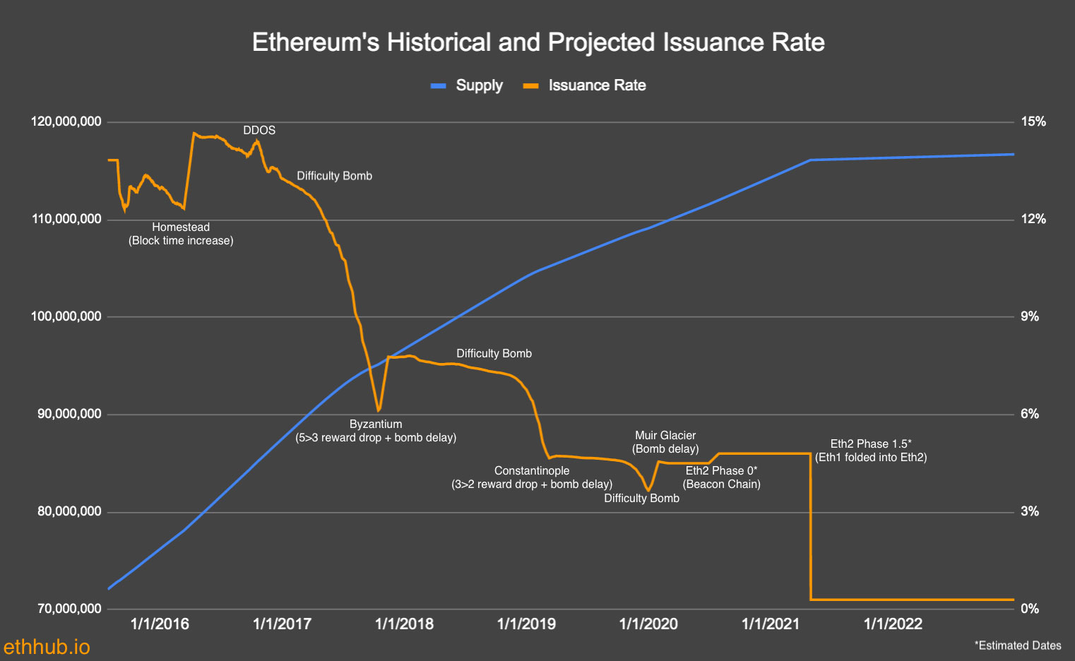
Each of the points on the chart are various architecture changes that have effected the supply curve:
- Homestead
- Byzantium
- Constantinople
- Muir Glacier
- Eth2 Phase 0
- Eth2 Phase 1.5
As an experimental technology, that’s fine, Ethereum is charting new territory with the scaling of its smart contracts, and they’re figuring things out as they go.
However, if you’re trying to forecast Ethereum’s future stock to flow, and use it as component in estimating it’s future per unit value, all these past changes introduce uncertainty into your model.
Will the emission curve stay flat, as per the graph, or will future upgrades require a change? It’s not 100% clear.
So rather than me peering into my crystal ball to give you an answer, I’d like to instead leave you with a thought.
On top of stock to flow being important, so is the project’s track record of changing the emission curve. So far, Bitcoin and Monero’s track record is solid, and no changes have been made.
All that said, it’s important to point out that I’m not saying ETH isn’t valuable, or that it won’t continue to grow in value. I’m simply pointing out that using stock to flow for ETH’s valuation has some risk, given the project’s past record of changes.
Roundup
When looking for a “safe” store of value, one of the metrics to understand is the stock to flow. If you come across an asset, like Gold, that has:
- Relatively high stock to flow
- High probability that the rate of supply will not change
This rules out the risk that the supply will be greatly inflated, making it a safer store of value.
Of course, the stock to flow on its own is worthless, but as a component needed in building a bigger picture of an asset’s value, it’s useful.
Related Links
There’s an interesting interview with PlanB and Pomp, where PlanB discusses the Bitcoin stock to flow model from 24m 10s.


Comments